Rebranding Singapore’s people-centric financial advisors.
TAGroup stands for The Advisors’ Group and was established in 2017 as a team of financial advisors representing Prudential Assurance. The founders have more than 100 years of collective experience in the industry, bearing different strengths that make the organization respectable. However, they realized that the brand did not have a strong affinity and faced a challenge in recruiting young team members to support the growth of the organization.
CHALLENGE
In recent years, TAGroup was on a mission to grow as a brand leader in the financial advisory marketplace. In order to stay relevant with the times, their branding needed an overhaul to better represent their values and corporate mission.
SOLUTION
Develop a new identity that communicates confidence and approachability, assertively establishing TAGroup as a collective of contemporary professionals.
SERVICES
Brand Development, Logo Design
Discovery: We researched the marketplace and interviewed stakeholders to better understand TAGroup as an organisation. Visually rebranding themselves as TAG, the organization wants to be known as a dependable, friendly, down to earth professional that is knowledgeable and does not push products for the sake of meeting sales targets. TAGroup puts the interests of clients first and approaches solutions that are suitable to the life phase their client is in.
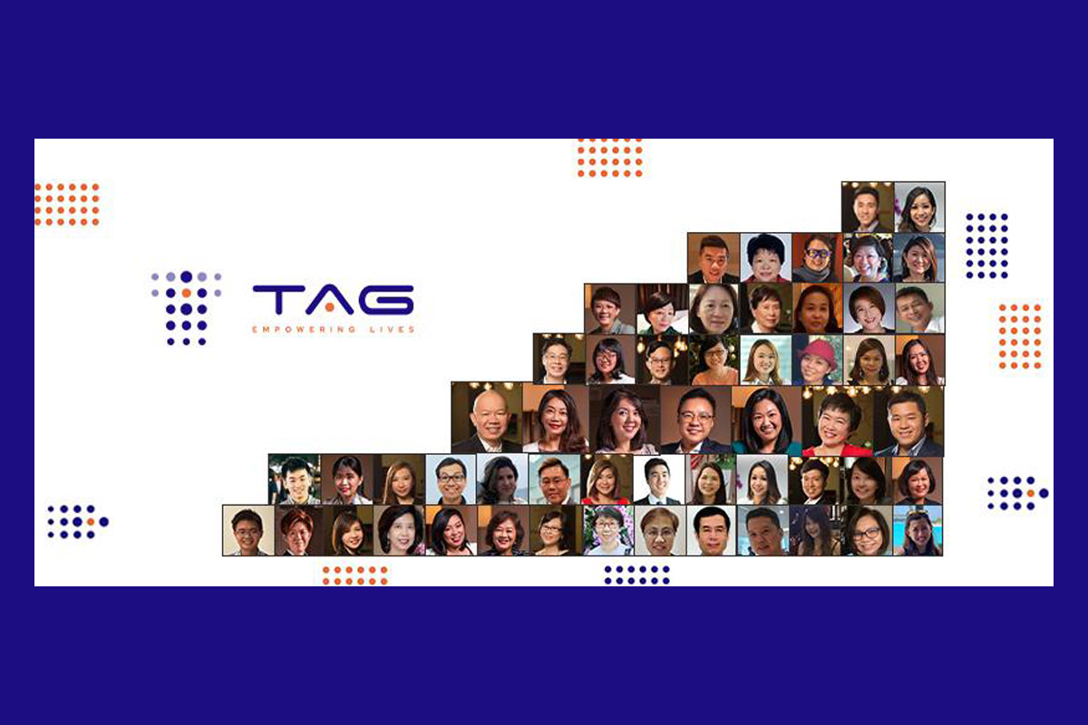
Brand Concept: The organization is very people-centric and the financial advisors look after their clients like family members. The camaraderie within the organisation, between advisors and clients, sets TAGroup apart in a competitive, sales-driven industry. This became the key insight for the redesigned branding that will future-proof them as a business.
Logo Design: The cornerstone of the new TAGroup brand identity is the logo. Symbolizing a close knit fellowship that embraces growth and progress, the logomark (icon) is made up of stylized dots. Forming the shape of the T alphabet, the dots also mimic the shape of a tag – a visual play on the brand name – connoting that TAGroup brings people together and collectively strives forward with enthusiasm.
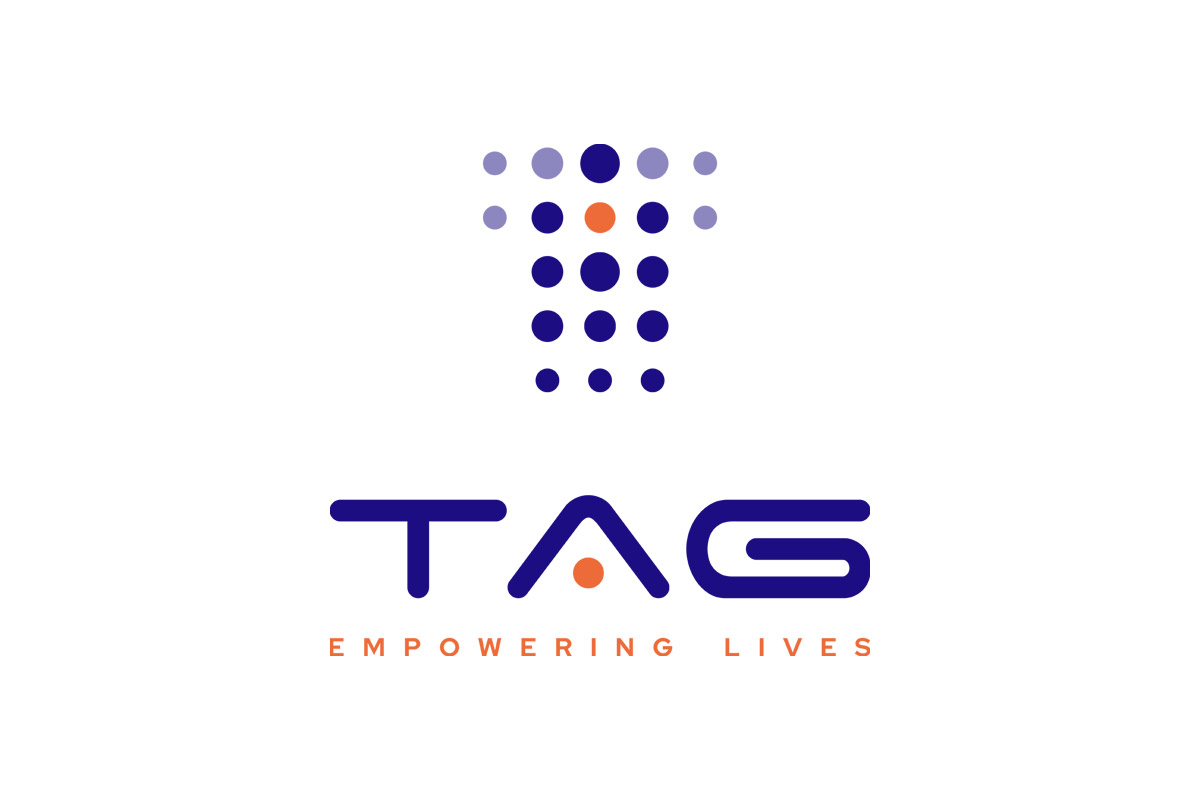
Secondary Logo: To introduce a playful element, we designed a secondary TAGroup logo that consists of two tags leaning towards each other. It implies a mutually supportive relationship between the brand and its customers. This element adds a touch of levity and whimsy to the TAGroup brand identity, indicating that the company is not rigid and inflexible.
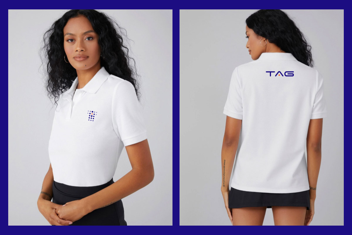
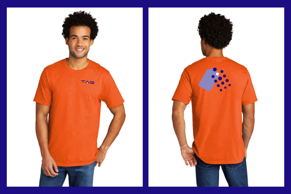
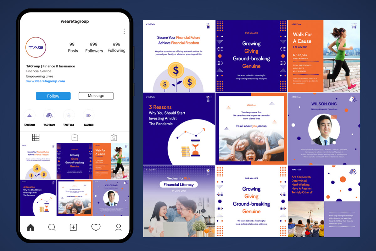
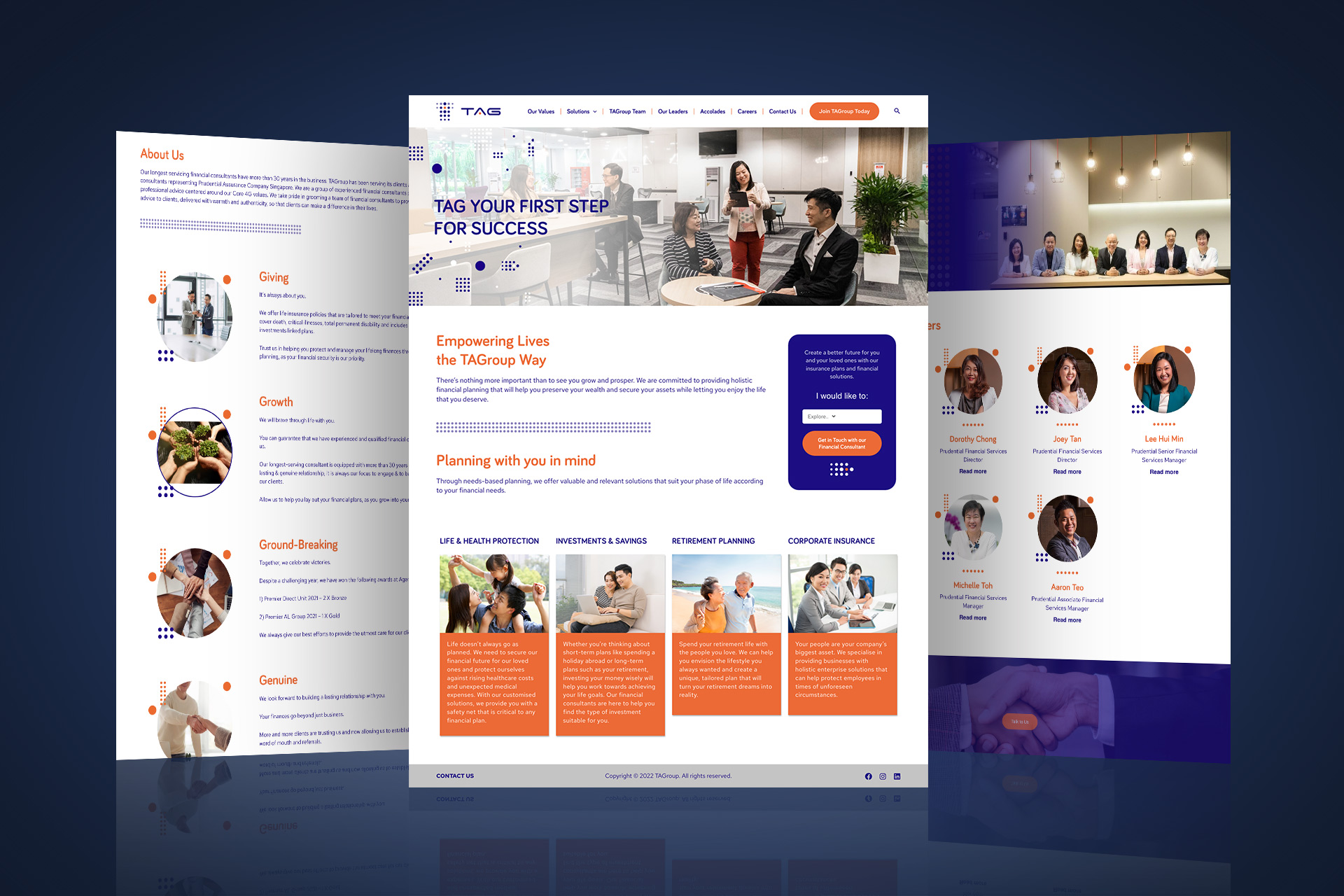
The balance of professional and family-like team was best implemented in tangible applications of the brand, including team apparel, website, and social media posts.

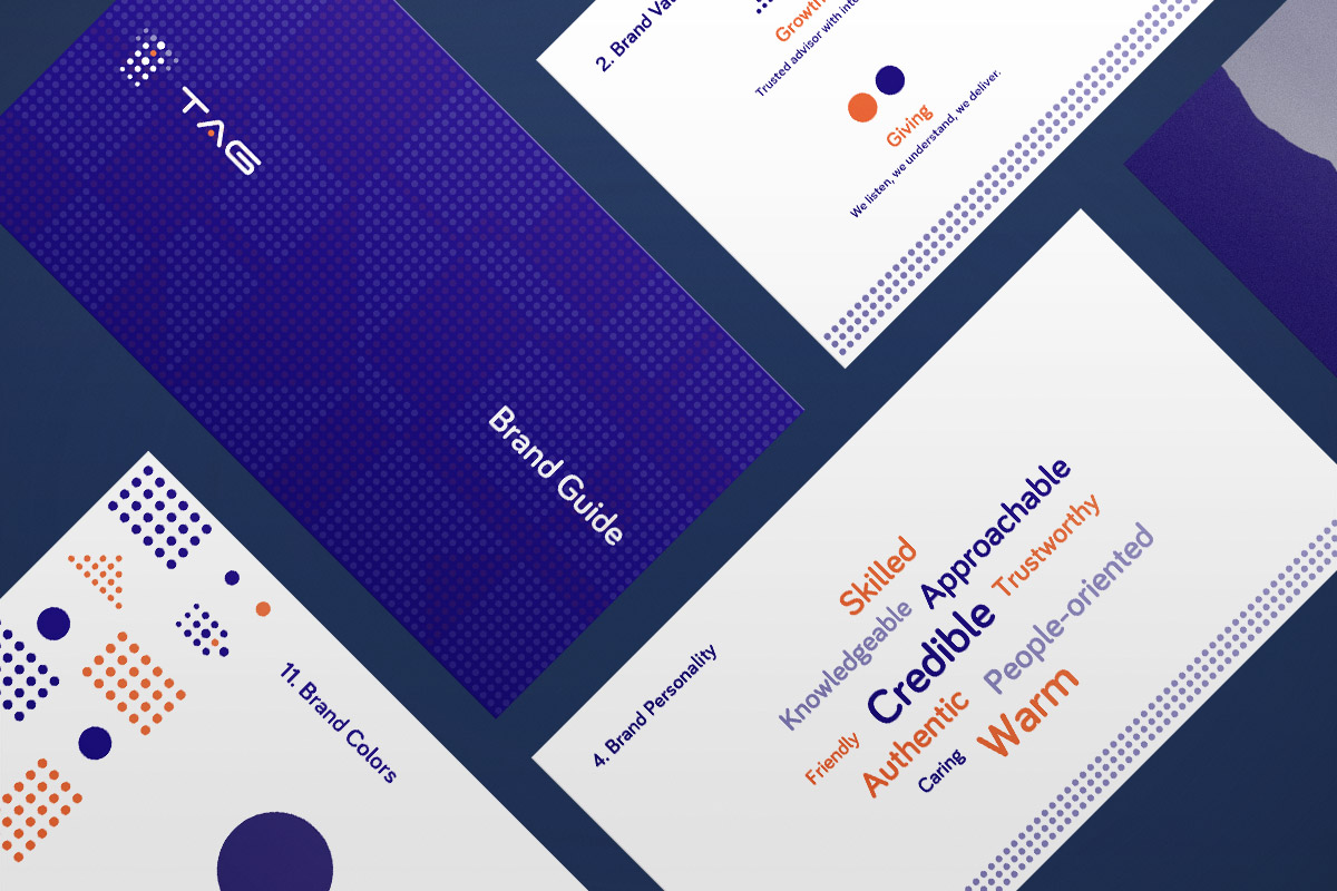
Brand Guide: Consistent and proper use of the TAGroup brand can aid stakeholders and partners in the efforts of developing and promoting awareness. We developed brand guidelines to provide a basis and are meant to act as tools to help guide design direction, look and feel. These guidelines are not necessarily intended to be the only design solutions available. They should not stifle creativity but to provide brand standards, consistency and quality control.
Client Testimonial
In 2021, when my organisation set to revamp our brand name for a new look, we went to a few and decided on Irene from Moonberry Digital. She’s able to conceptualise from our values, identity and profile of people to create a brand name which our internal stakeholders and clients could identify with, and find it a good representation of us across the different marketing platforms.
Joey Tan, Director